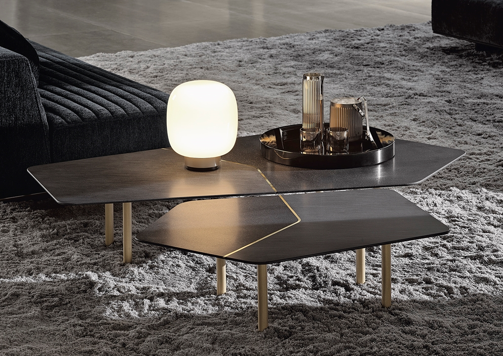
Contrast is one of the most important and active ideas in design. Contrast means choosing opposite elements and setting them next to each other to add interest and make further points stand out. Sometimes, it is just a matter of light and dark, smooth and rough, or old and new, all of which help point the viewer's eye and help define the space.

Contrast plays a key role in interior and environmental design to liven up and avoid boring spaces. The room might look plain when a room's colours, textures, and shapes are alike. Changing the colour, material, shape, or size makes the space more captivating and unique. Likewise, an elegant matte black chandelier placed above a pale wood table will catch your eye and be a beautiful main feature.

Contrast can be established in different manners. The effect can be powerful when you use colours that contrast a lot, like yellow against blue or vice versa. Combining two textures, such as metal and stone, gives style to the space and makes it more pleasing to look at and touch.

The colours become even more significant in such places as streets and parks. It helps point out the changes from one zone to another, helps people navigate, and shows where they can pause or move. For example, a park with many trees surrounded by places for people to gather or a playground with different colours to help kids stay safe.
Then again, contrast has to be used with purpose throughout. If you put down loads of decoration, the place may become overly cluttered, and if it's without much, your space could look uninspired. What matters is establishing the perfect contrast to support the design's main goal and general atmosphere.
To sum up, our instinct for variety and clear understanding is what contrast reflects. It leaves areas looking more attractive and offers them a livelier, more expressive, and more practical character. The proper use of contrast can make any simple design interesting and powerful.


No comments:
Post a Comment